

Propel Instagram Advertisement
The Propel Instagram Advertisement is the name of an exercise in advertisement. Taking the concept of Propel fitness water, I reversed its main selling points and used them to create a product with the opposite effects, that people would still be interested in buying

The ‘SOCIAL ADS’ project
For this assignment, the goal was to create a three panel instagram ad, accurately advertising a product as if we were apart of the current marketing department. It needed to blend in, and be something you were more than likely to see for the product. I didn't really have any ideas when we started out, so I looked around my life for the products I use consistently, that I had a working knowledge of.
Propel
JVC Bluetooth Headphones
Iphone
Dropbox
HeyDude Shoes
The only one I could really work with was propel, considering all the ads are relatively the same, and I drink 5-7 bottles of it every day. I needed to envoke the feeling of raw power, energy and performance. The most difficult part of this project, was creating my own photoshopped elements to work with.
We had to list off adjectives to study from. I wrote out the following.
sweet
electrolytic
energizing
Healthy
Athletic
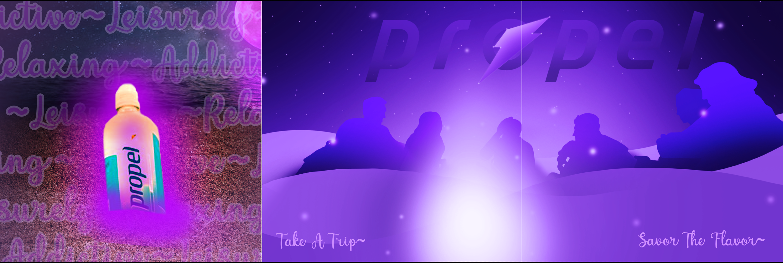
In part 2 of the assignment, we had to take these and promote the same product, but using antonyms of the words. Mine were the following.
savory
diuretic
relaxing
addictive
leisure
This was also a difficult process, as I essentially had to go from advertising fitness water, to advertising iowaska.
R&D
I didn't really use pinterest for this project. Instead, I went directly to the source. I needed my work to blend in so I decided to study Propels work. I researched the history of their logo design and what it meant on logos-world.net. I went to their website to read up on their notes. I went through as many google image search results as possible.


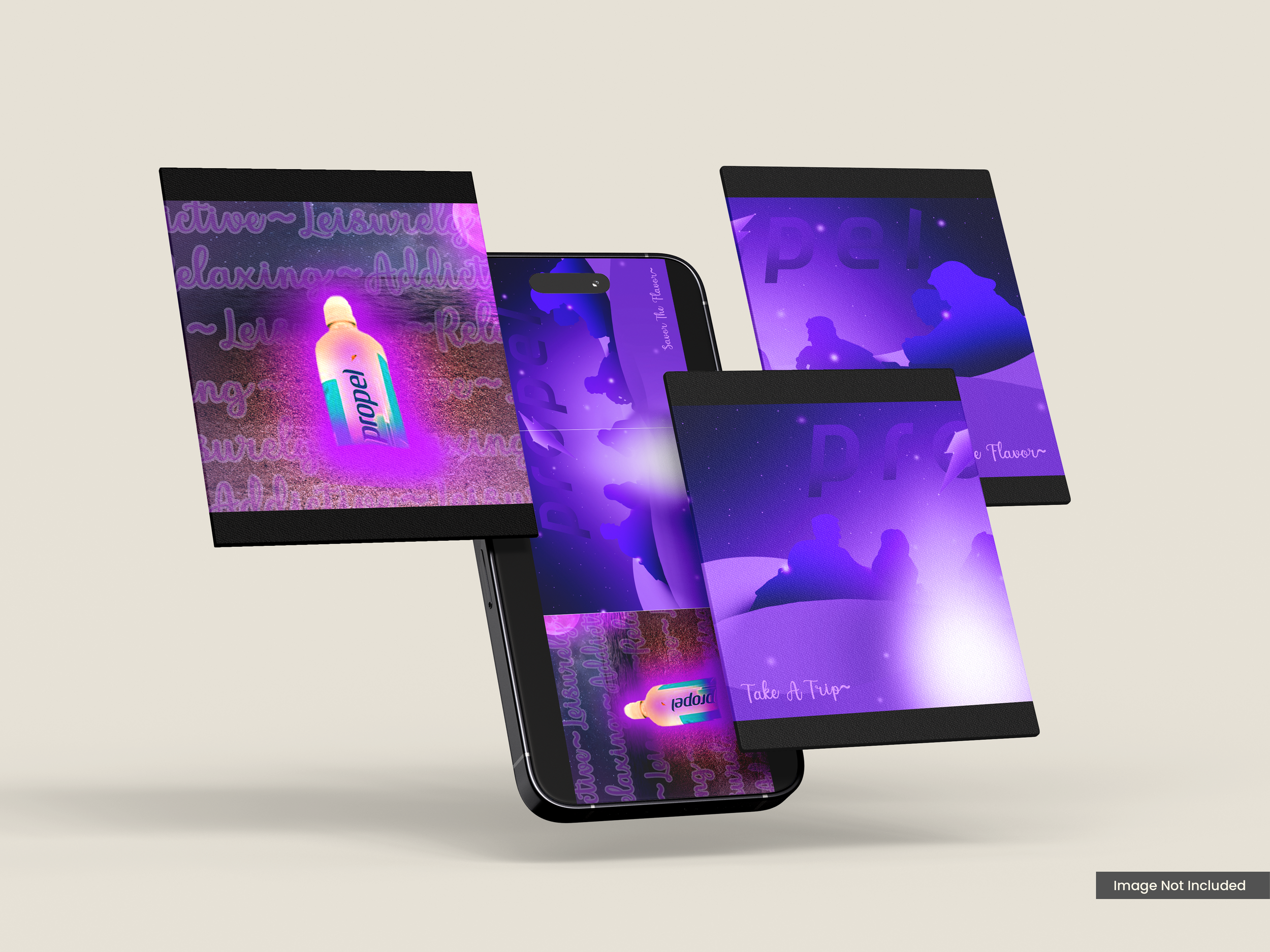
Final Version
Starting with the first part of the assignment, i feel like I did a fantastic job capturing the likeness of a propel ad. While they have other flavors and label colors I think purple really works best in capturing the feeling of power, AND relaxant. I had fun photoshopping the materials together in slides two and three, and feel like I could easily see this as one of their own.
As for part two, it was a little trickier to get my footing at first. I worked for 2 solid hours to get that bottle to glow AND be buried on the beach. I wanted to give off the feeling of a late night party with friends, and feel I succeeded. It gives off a very mysterious feeling, of young adults around a campfire in bliss. if theres one element of it im proudest off, its the constellation I added in to mimic the shape of the Gatorade lightning bolt.