

The JW Pepper Poster
The poster was apart of an assignment to create some much needed advertisement for an event at Murray State University
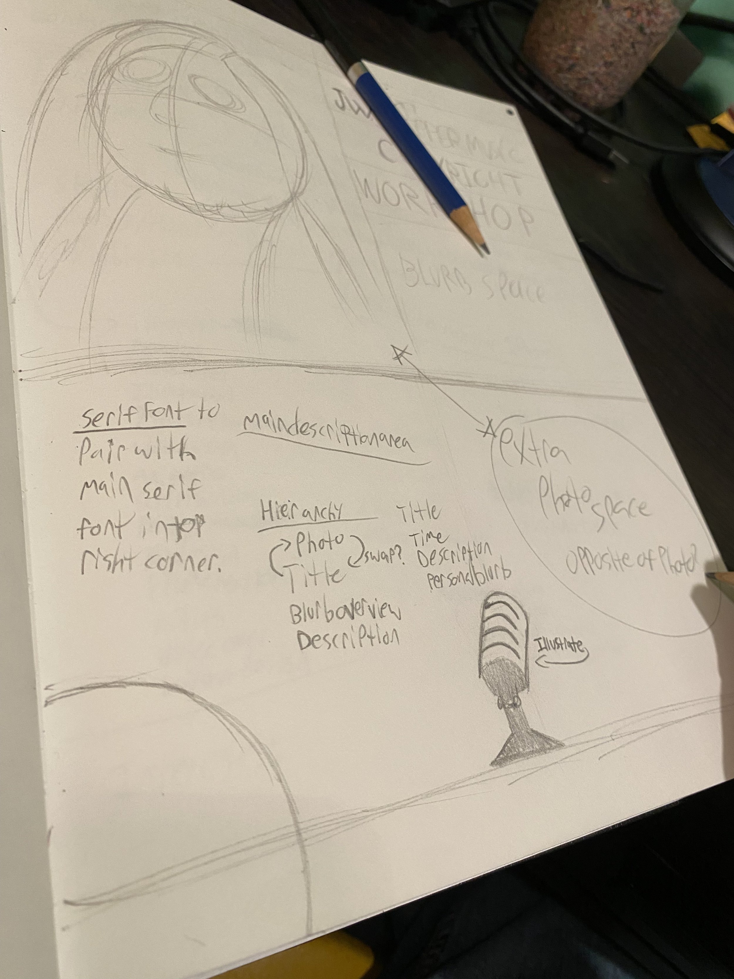
Early Sketches
From the beginning of the assignment, I had some idea of what I wanted as far as a layout and design. The only information given for the poster, was as follows:
Jennifer Wright from JW Pepper will be coming to PAH (Performing Arts Hall in Old Fine Arts) to present on copyright and how it affects our Music Majors. This is for all of our majors-music business, performance, musical theatre, and music education. (Just an fyi for you) It will be from 3:00-4:30pm.
I almost immediately began putting my ideas onto paper, doodling a couple of concepts. I knew for a fact I wanted roughly 1/4th of the page to be taken up by the headshot we had been provided. Introductions would go next to it, and description would take up the whole of the bottom. I didn’t know what yet, but I wanted some other graphic elements in the bottom half to offset the text to keep it from being stale, appearance wise.


R&D
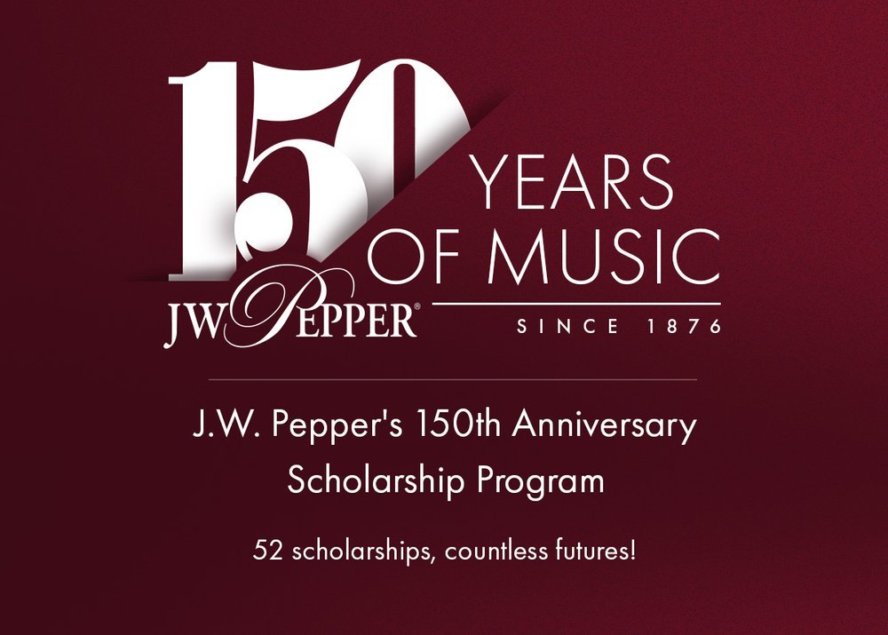
After preliminary sketch work was completed, I took to Pinterest and the official J.W. Pepper website to do some visual research. I wanted to know what sort of aesthetics and design choices would best stand out to my client, and blend in with the works they had used in the past.
I struck gold upon finding the branding image celebrating their 150th anniversary. I chose to use similar font styles, and the same color gradient they had chosen as their background.

Iterations
Throughout the design process, I didn’t much stray from my original intention. As time went on, I slowly stripped away more and more details, simplifying as I went. One design element I was always adamant about keeping in were sheet music stanzas, but early iterations clashed horribly, always dragging away too much focus to themselves, instead of the writing.


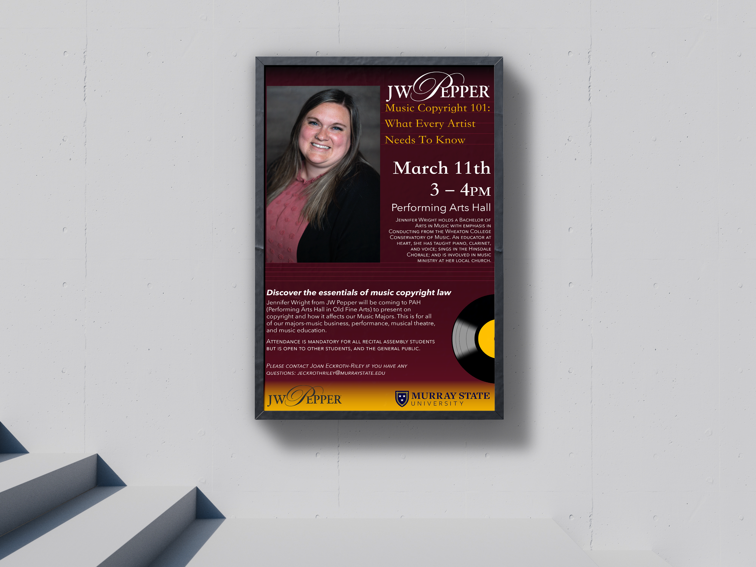
Final Version
In the final moments of editing, I cleared out the stanza-esk lines I added of any detail, and settled on the title ‘Music Copyright 101: What every artist needs to know‘.
Im very happy with my usage of hierarchy in this assignment, placing the most important information near the top, large and in charge while keeping descriptive elements that people are more likely to overlook near the bottom, neatly organized.
My final iteration was loved by the head of the campus music department and she was delighted that I had used JW Peppers 150th anniversary flyer as a jumping off point for my design. This became a piece I was truly proud to of created.
