

SimPeak.
(A Case Study)
SimPeak is the name of a small electronics and convenience company that had very poor branding when I first found it. For a college assignment, I spent a good two weeks evolving and updating their logo and adding some much needed brand recognition to their products
The ‘ALPHABET SOUP’ Project
The point of the alphabet soup project was essentially to breath new life into an established brand with little to no branding whatsoever. The best place to look was Amazon. I had very little experience with amazon shopping, and had never really run into any sort of production company like what I was meant to find and I was a bit lost in the early states of work. So, I decided to filter my requirements through a program, that would spit out the kinds of companies I was looking for. This would give me a start to my search, and would likely -and DID- get amazon to show me other lines of products from similarly low budget producers.
Requirements for search
20 names of the least marketed and unheard of brands in the last 10 years
That don't have well received or recognizable logos, and haven't had a rise in popularity
That also make products hardly anyone wants. Brands that are hardly profitable at all, if not in the red
That might have appeared on shows such as SharkTank, weren't accepted, but still attempted to make a business anyway despite their failure.
That also produce niche products with limited demand, leading to minimal profitability or financial struggles, AND have products for sale on amazon
That have less normal sounding names. Maybe some who's names are more of a mess (an alphabet soup if you will)
The output received was as follows.
FeaMont | Simpeak | iRobotBraava | HoMedics | Oaxis | Qubii | Quntis | WyzeCam | Paww | MUSCCCM| HIZPO | Ubeesize | KOBRA Products | VeSync | Teepao | VANKYO | Shashibo | Ufun | MUSCCCMI | Beboncool | YIHUA
Best Options
HoMedics | MUSCCCM | Quntis | Ubeesize | Simpeak | YIHUA
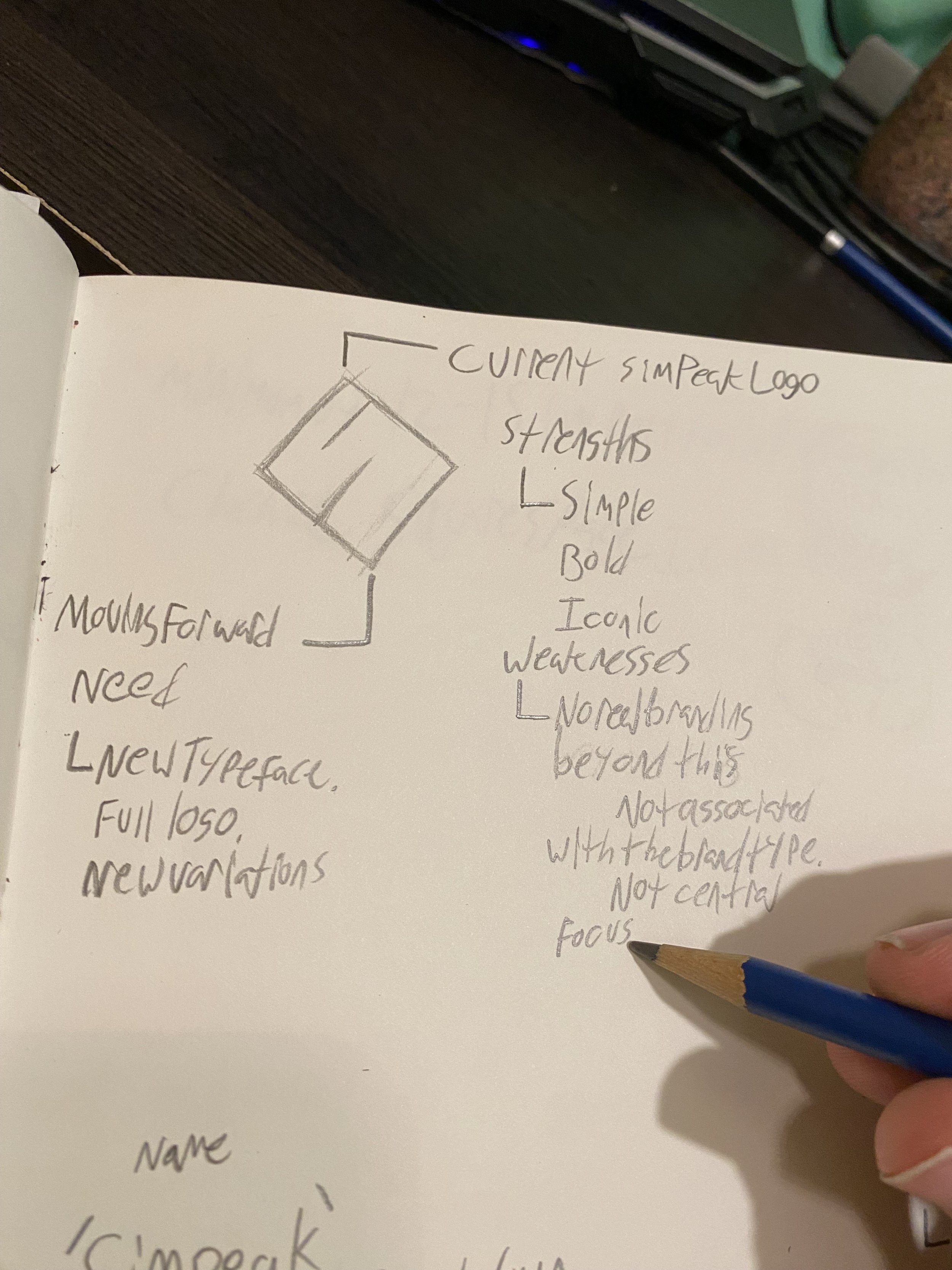
I ended up settling with a small producer known as ‘Simpeak’. It was practically unheard of, made products that were better produced by other people, their website was half done and missing important elements, products made were poorly branded, and their main logo was just the word ‘Simpeak’ in a blue sans serif typeface. It wasn’t until the next day that Id stumbled upon their practically unused logo mark at the bottom of the homepage, implemented quite literally nowhere else.
This branding felt like it was still in the fetal stage of development, so I wanted to start where they left off, and run with it, to see exactly where I could land with the branding.
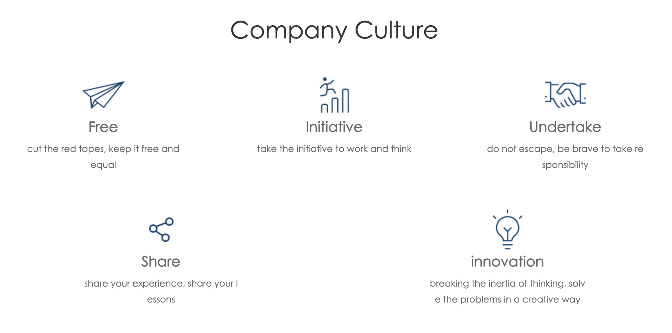


Much information to create the new branding needed to be pulled from the ‘Company Culture‘, to really get an idea at who I was designing for and what principles they stood on. Seeing I was designing for a client I couldn’t communicate with, it was the next best thing to learning about the needs and desires of a new brand.
Early Research
Im not sure wether to be proud or ashamed but, I didn’t actually do very much outside visual research for this assignment. In fact, for almost the entirety of the assignment, I never even clicked outside my Illustrator window unless it was to examine the site some more for more of its information. I basically hit gold almost immediately, and never lost momentum.
I researched the brand in depth, scanning across the whole of their website, which held all elements of their branding, including a couple adjectives. So I went with what I learned from them.
Free | Initiative | Undertake Responsibility | Share | Innovate


The Process
I wanted to start where the original creators left off. So I looked at their ‘Type Only’ approach to branding. Its not that uncommon, earlier versions of certain Apple products would use the name instead of the apple logo mark.
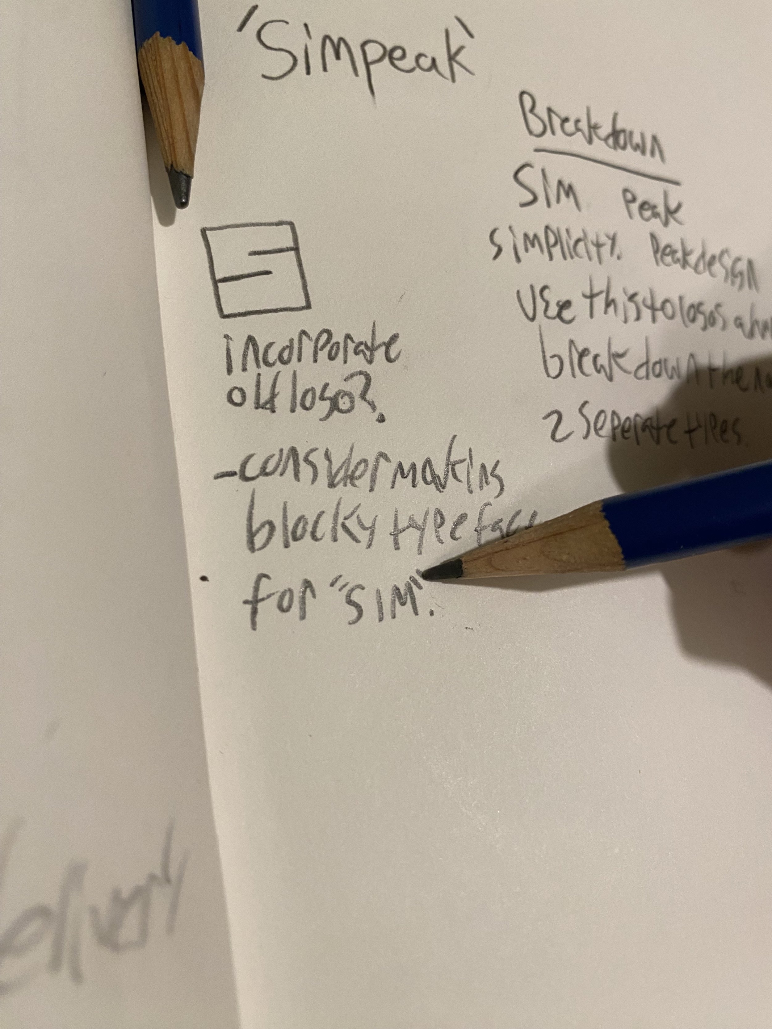
My thought process was to break the name down. Simpeak obviously meant ‘Simple and Peak design’, so I opened up an illustrator document and laid out Simpeak 20-30 times. I wanted to really stretch my creative muscles before getting down to real work, so I kept changing the font, sometimes for the whole name and later on two fonts split between the name. I wanted to see what i liked and what didnt before making any real decisions. It wasn’t till later on that I considered incorporating the brands initial Logo Mark more. Up until this point I had been making ‘Sim‘ the more boring and simplistic font style, and ‘Peak‘ more big, bold and powerful. The logo mark was an S for Simpeak, so my thought was, ‘why not switch things around, and make SIM the bulky one’. I set out from this point to design my own blocky font with no curvature or spaces, based solely on the design of the logo mark.
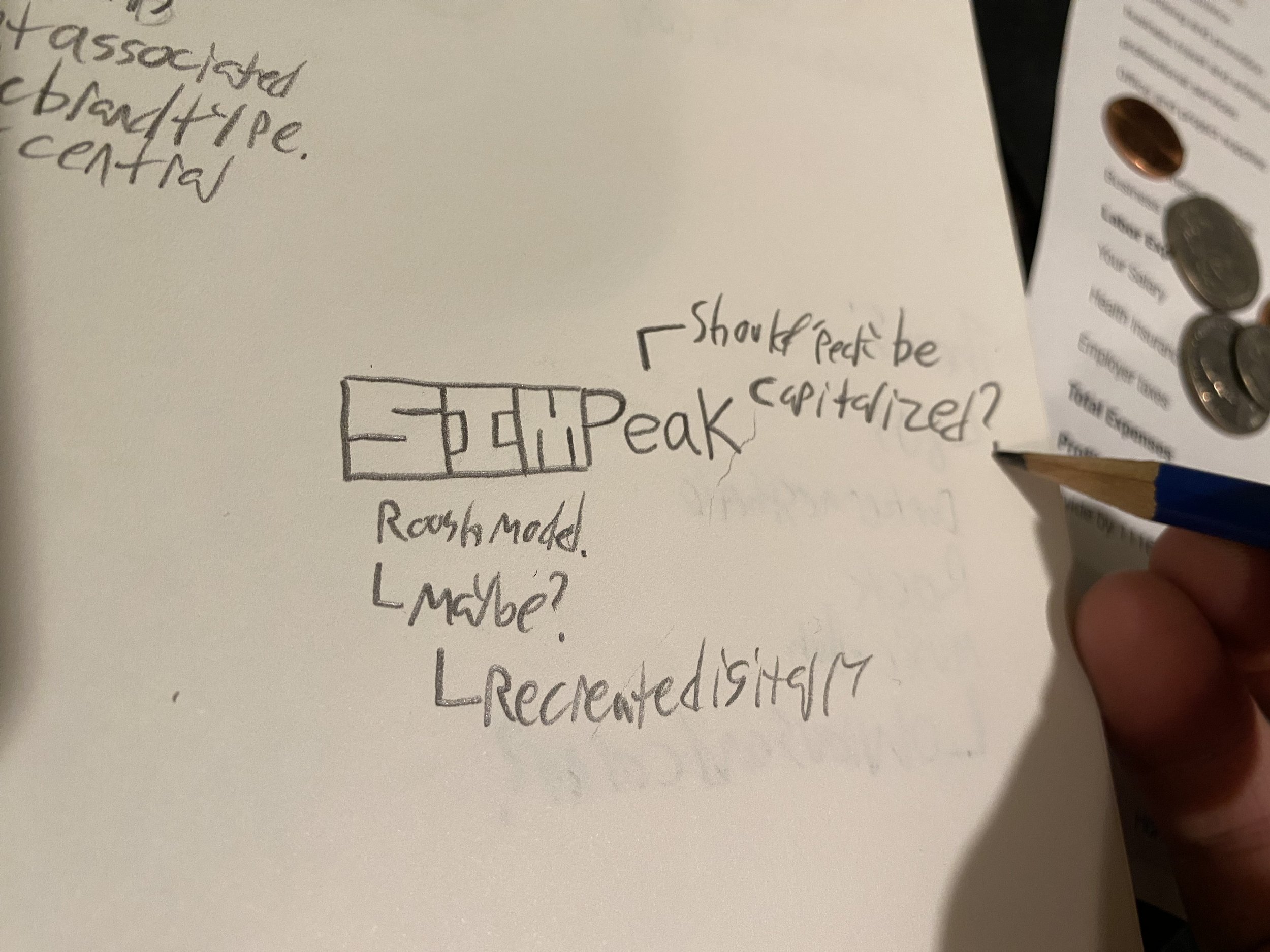


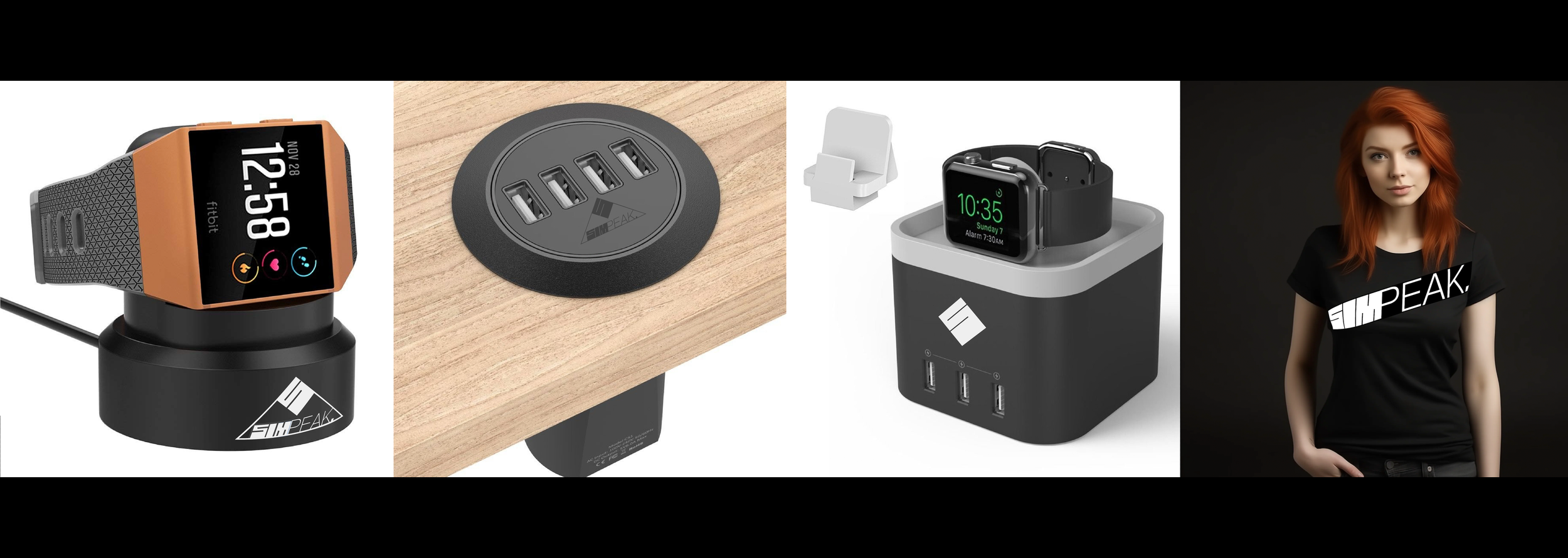
Logo Image
The image itself went through a wide variety of designs. I wanted to incorporate the sites original logo image, simple though it may of been, to have a jumping off point and keep the original thought process they had in mind for their branding. It was important to me that I not completely upend everything they had tried to do, and instead, gave life to their basic ideals.
Regardless, for almost the entire process of design, I knew a simple element i wanted to keep consistent. No matter what, I was going to find a way to always connect the M to the P. It made it look sleek, innovative and oddly cool.
At some point in my process, I decided to get a little more experimental. Throw stuff at the wall till something stuck. I knew sometimes logos would just be a word or name with a mark above the center, so why not try it? Seeing the negative space left in the sides, It was practically begging me to complete the shape. I thought maybe a diamond would look neat. And then when I decided to just try a triangle, it hit me. ‘Mountain Peak’. Admittedly, it took a hilarious amount of time to make that connection, and mountains had nothing to do with the brand, but I just couldn’t argue with how well it worked in design. it looked like Mt. Fuji, and it rocked.
Final Iterations


I came to settle on a simplistic mountain peak for the fully realized design, that could be broken up into 3 separate designs for the purposes of branding. Because of how i worked on it, this project felt more like working on one of my videos or illustrations on my own. I was very much free form with it, and worked instinctively instead of following some set guideline. I feel like I did a fantastic job of keeping the original feel of the company, while also breathing more life into it. And honestly, I wish I could sell this new version to Simpeak and see what happens. I really feel like it would improve their business.