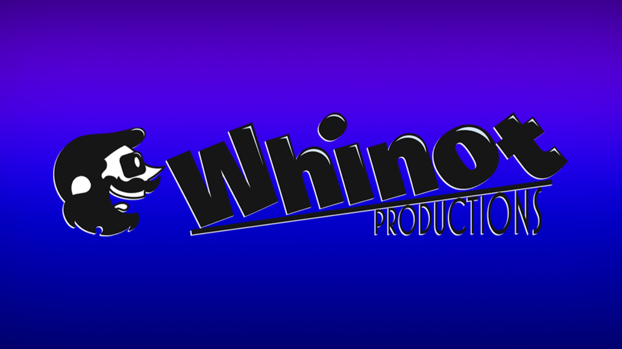
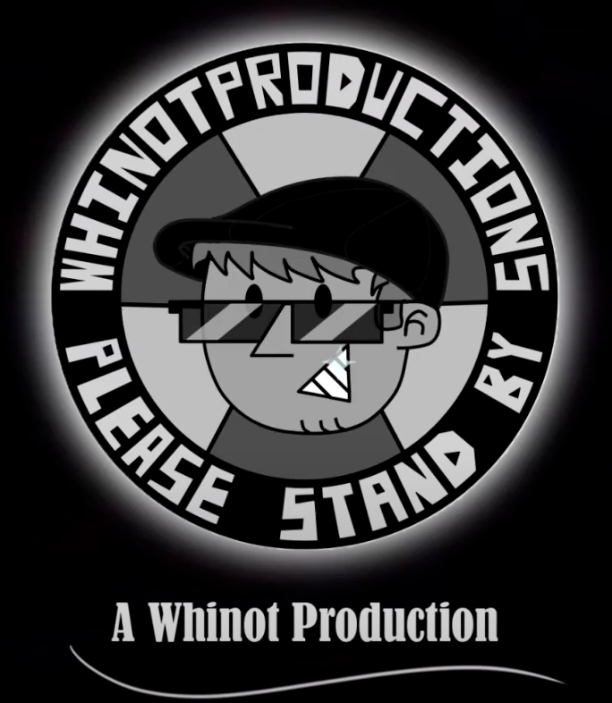
The Whinot Productions Logo
The big W.P redesign was the very last project I ever completed for college, and a very important step in turning Whinot Productions into a professional brand.
Introduction
The following process details are unedited from their original state, as to preserve the thought process
Whinot Productions Logo
8/26/25
Whinot Productions is a fictional studio I've been working on for the better half of 7 years, run by the fictional character ‘Whinot Toonish’. Whinot is a sort of living mascot and face of the brand. In reality, I utilize the label of Whinot Productions for my YouTube channel, Instagram page, Radio101 show and most everything else wherein I do creative work I'm passionate about.
For my BFA show there are still certain resources I'll need and/or want to add in. First on the list is a brand new logo for Whinot Productions, which I intend to use in a later stage of my BFA show work, namely my series page banners which will require the repetitive usage of the logo.
History & Research
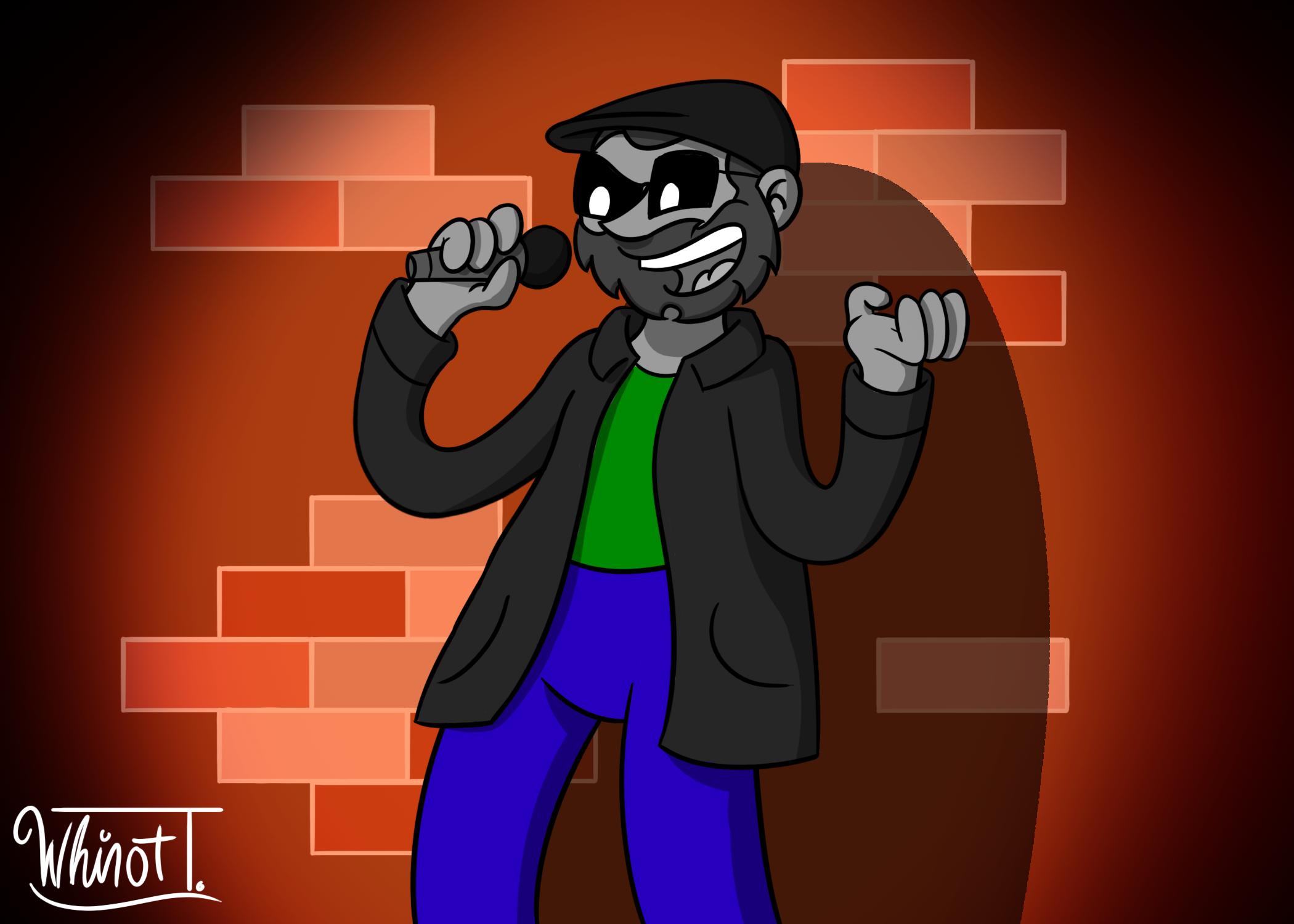
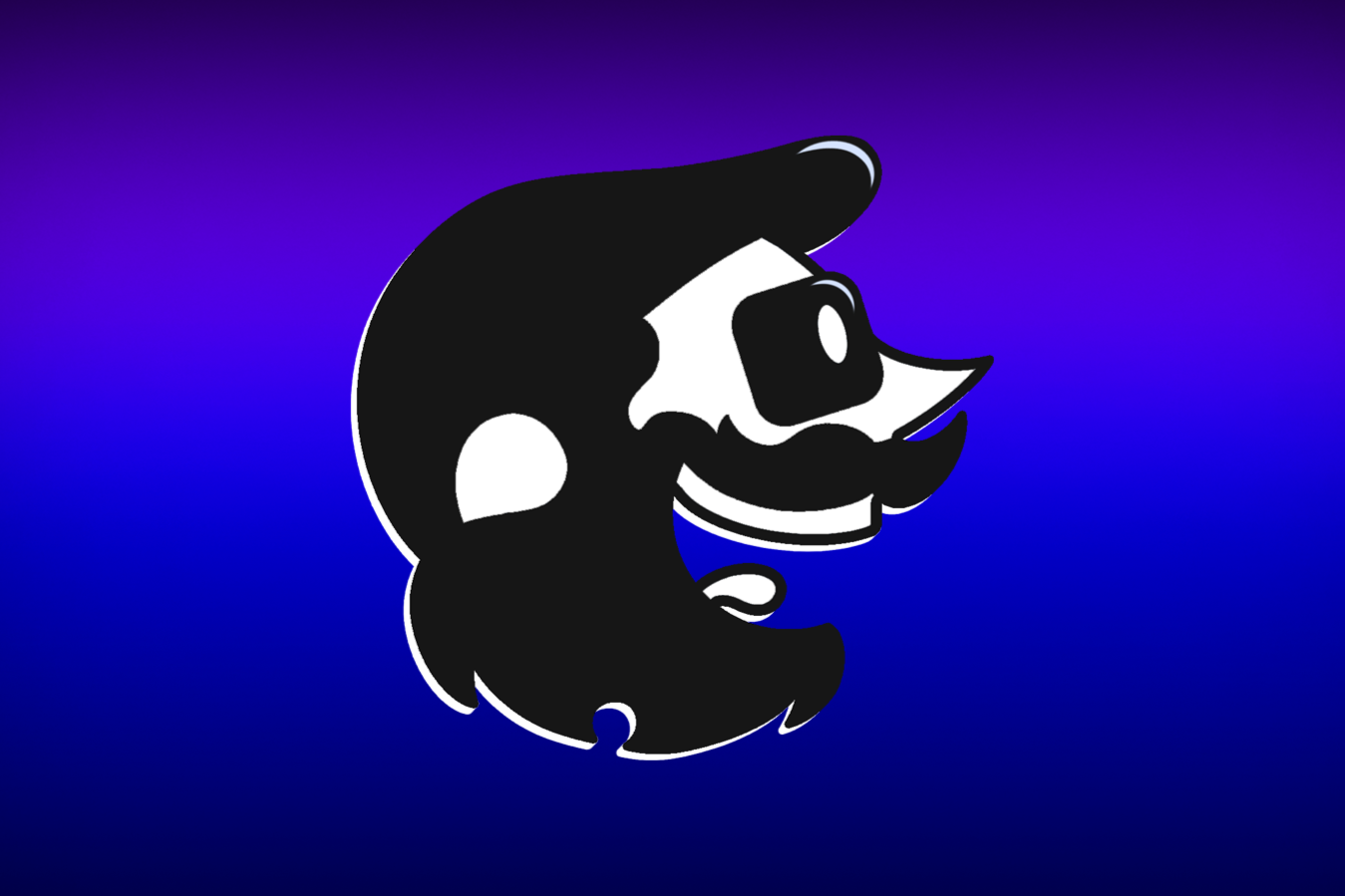
Present Day Whinot Toonish (Reference Image)
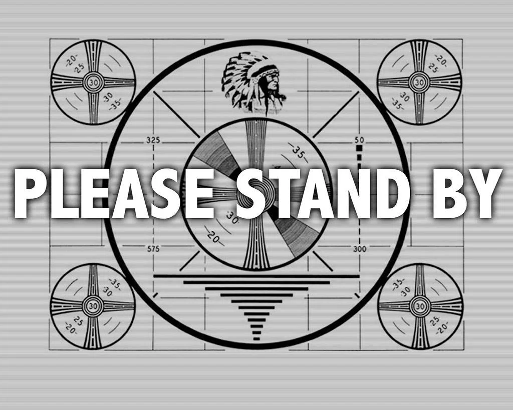
In its earliest form, The Whinot Productions Logo was loosely based off of the soviet era ‘end of broadcast day’ illustration that would often play on Television stations in the absence of programming. The logo ended circulation in early 2022, with its final online appearance being in the Second Run Intro Sequence.
The logo was created late in highschool, and used in lieu of a more official and definite logo design. As of now there are no plans to pull it out of retirement due to a number of factors such as style, complexity and a generally unpleasant appearance
In recent years, used in place of an official logo has been the 3D Whinot Productions Intro Sequence, https://www.youtube.com/watch?v=XIsOowTvmKc which utilizes a simple but recognizable style, serif fonts, and a simplified 3D model of the titular characters head.
This could prove useful as a first idea, creating a flattened version of the final shot.
Takeaways
Whinots Inverted Eyes
Whinots Hat
End Of Broadcast Day Message
-
A thicker font with a fun and bouncy quality to its appearance.
-
The ‘I’ in Whinot is both near the center of the name and the only letter of the phrase ‘Why not’ to be misspelled, meaning doing something unique with it specifically to add emphasis would be a smart course of action.
Other Areas of Emphasis
First WP Logo (4/2019)
Other ideas of emphasis may include staples of Whinot Productions or the mascot, (Ex. A common Disney logo utilizes the shape of mickeys head)
-
The prime candidate would be either the dot for the eye, or a variation for the O in Whinot
-
This could throw off the I and O in the word Productions.
The monochromatic nature of the eye could prove ineffective when considering monochromatic variations on the logo.
-
It could rest atop the O as if it were a head
-
Despite Whinots hat being a staple of the character design, it wouldn't likely read well when flattened. and could prove distracting
Advise not using this as an option.
Whinots Remote
-
Its an established element that shows up in various locations throughout the history of the Studio.
-
The only real place it could be placed is in the I of Whinot.
The detail of this would dissapear in smaller formats
This would likely not be read as a remote on first glance
Its confusing to new viewers.
Way too many cons, Bad Idea
Simple Observations
Taking note of simple obvious visual elements in the plain logo could help in coming up with ideas down the line
-
Considering the differences in length between the two words of the name, It may be best to keep Productions either smaller or the same length as Whinot.
-
The W in the beginning of Whinot has a Slant \ and ends with a straight |.
HIN sandwich together perfectly, whereas N O T do not share any interlocking grooves.
Maybe if I slot O beneath the limb of the T, but it likely wouldn't look appealing
-
‘i’ is probably the most prominent letter in the name. Its a typo, its the strongest vowel in the name, its the thinnest letter
I keep going back to the idea of replacing the i or making it stand out in some notable way
How bad of an idea would it be to just Luxo the whole letter and make a Whinot Silhouette in place of the i.
It would add an extra layer of prominence, as the ‘i’ in Whinot, would be Whinot. From the characters perspective, ‘I’
O is definitely the second most prominent from a more visual perspective. Regardless of typeface, serif or sans, If im keeping it capitalized, ‘O’ looks like the odd one out.
Its the only letter in the name with natural curvature, and no straight lines at all. This makes it another great choice to replace with imagery for the purpose of branding. Theres also just something compelling about a type of logo for the brand appearing so far off center of the name.
-
Part of me is tempted to just rip off the Disney+ logo, considering Whinot ends with a t, similar to +
Seriously though, bad idea on paper, but good for a laugh later, maybe throw it into a joke somewhere else outside of the real branding
-
Less of an observation, But I will officially be removing Green from the branding color pallet, and sticking with Purple as the main highlight, along side my monochromatic color scheme.
8/26/25
Modified Youtube WP Logo (11/2019)
The main issue of creating a logo for an established location or character, is knowing how to give the audience just barely enough information within its appearance to give the right idea and lead them inwards.
The secondary issue in creating a logo, is the fact that its for my own studio, meaning I call the shots as far as what works and what I find appealing. And considering the fact that Im not sure how to answer that, this will be a challenge to research.
Im trying to look at this primarily through how it'll look in a monochromatic style for certain elements, but its shockingly hard when your character is already comprised on black, white and 2 shades of grey.
Visual Research
What is Whinot Productions, visually speaking?
Its important that I know going into this exactly what i’m looking for in terms of aesthetics. So the main question to ask is, what it should feel like?
-
Its fun
Unique
Attempts to look professional
Realistic yet exaggerated.
The Typographical Stage
Font Options
The main drive of Whinot Productions is general entertainment in media
In compiling a list of fonts to use, Ive realized two things that I never did before.
‘Whinot’ looks more like a word than ‘WHINOT’ for many fonts
If I want to stick with a thicker font type for the first half of the name, Sans Serif fonts are less appealing.
For some of them, the name works and reads fairly well, and manages to pull off a decent sense of style. But for far more typefaces, ‘WHINOT’ fails to read as anything when utilizing sans serif fonts. .
-
Film
Music
Broadcasting
Illustration
General Notes
I don’t hate how WHINOT looks in italics, but I just dont think it reads for what i’m going for style wise.
-
I don’t hate how WHINOT looks in italics, but I just don’t think it reads for what i’m going for style wise.
-
Cochin may be the font I used in the 3D Intro Sequence
-
Fonts that have too little spacing between letters will not be considered.
Regardless of if they’re sans serif or not, it makes the word suffer from the same issue as before, that being the inability to read it as a legible word.
-
Theres a clear difference between a font being far too thick and far too thin. This swill help to narrow down my choices. Too thin, and it no longer gives off the fun and bold look I want to capture. Too thick however and it looks less like it belongs in the logo, and more like it belongs on the sign of an old saloon.
-
In the same light ill be fully avoiding fonts that too closely resemble Impact. I don’t like impact as a font, its somehow a perfect mixture of too boring and too loud, like someone who’s whole personality is yelling everything.
Which reminds me, nothing too strict and rigid. I don’t want a LOT of curves, But I don’t want everything to just be straight lines and hard edges. I want something like the character; Realistic yet exaggerated.
-
Nothing cursive or cursive like. Too fancy, too 80’s and too flowery.
-
I cant really explain it, but all the Monstra fonts look like they were designed exclusively for the show ‘My Life as a Teenage Robot’. Anyway, im throwing it in just in case.
-
Ive just gone back to edit an earlier part of my process doc. O very obviously has prominence and would work well for a logo image replacement. What that is, Im not certain
Ideation
Letter Replacement
Its become increasingly more obvious that the correct corse of action in designing this logo, is most likely going to be replacing a single letter in some way, and making ‘that’ the logo image. In order to do so im going to have to get creative and really examine the name from all angles
“ i “
Ive already been over this earlier in the document, But the I holds a decent bit of prominence when considering the name of the studio. Its a typo, it takes center stage, it could be the ‘I’ of the mascot character itself, overall its not a bad idea. The best course of action is likely going to be adding a tittle of some sort.
-
Its a centrally located logo element, if designed right it could be a stand alone, and it would require minimal adjustment to the typeface.
-
Its not going to be very big, meaning whatever I do with this option has to stand out clearly.
“ o “
The O stands out well as it has a uniquely different shape from the other letters in ‘WHINOT’, making it a prime candidate to be replaced by a logo image of some sort.
-
Its off to the side instead of dead center which creates a unique organization.
It takes up for more space than the dot of an i, so I could add more detail into it.
-
What exactly can I replace it with thats gonna make sense to both an incoming audience as well as current ones?
I am once again tempted to just pull a Disney and make a silhouette of the mascots face.
Come to think of it, thats really not a bad idea…
“ H “
Something I noticed randomly are the spaces foudn within the letter H. If looked at a certain way, they could resemble the common design for Whinots Eyes. Most commonly, theyre just squares that fill with his inverted eyes. If I fully removed the H, I could just keep the squares on top and bottom, and give each one a little hole to replicate the design in some way.
-
It’s clever, can be read as the character in some way, and would make the name stand out in a simple but effective and unique way.
-
This isnt going to be something that works with the vast majority of fonts ive chosen to work with thus far.
Jim is most likely not going to like it as a design choice.
Do I care..?
Definitely an option worth sketching out
“ i “ again
Going off of the idea with the H, If I use a serif font, then the gaps between the HIN will form the exact same gap space. If I flatten the word a bit, itll have the same square design as the eyes on the character
Sketching / Thumb-nailing
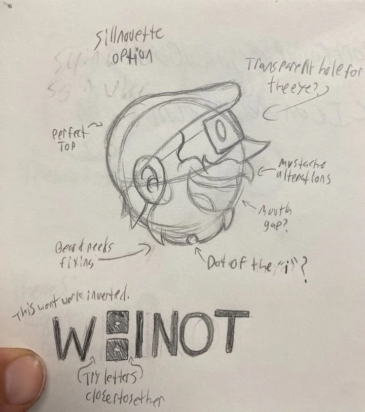
Figure 1. (Silhouette Sketch)
I decided to start with my silhouette idea to get an idea down before it was forgotten. It was a rough draft, and some areas need to be corrected, But its not a bad start.
-
Id like to create a secondary version of the silhouette, where i cut through it to create implied lines of detail, and see how that looks.
If I go with the solid black silhouette option, It may be a smart move to position the crescent of the characters beard above the I, as an implied dot. It may look nice together.
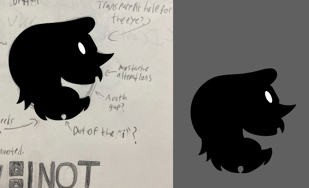
Figure 4. Silhouette creation
I did still want to try a few of my earlier ideas in the mix, like incorporating a sillhouette. Im not certain if its what ill end up going with, butI do like how it came out.
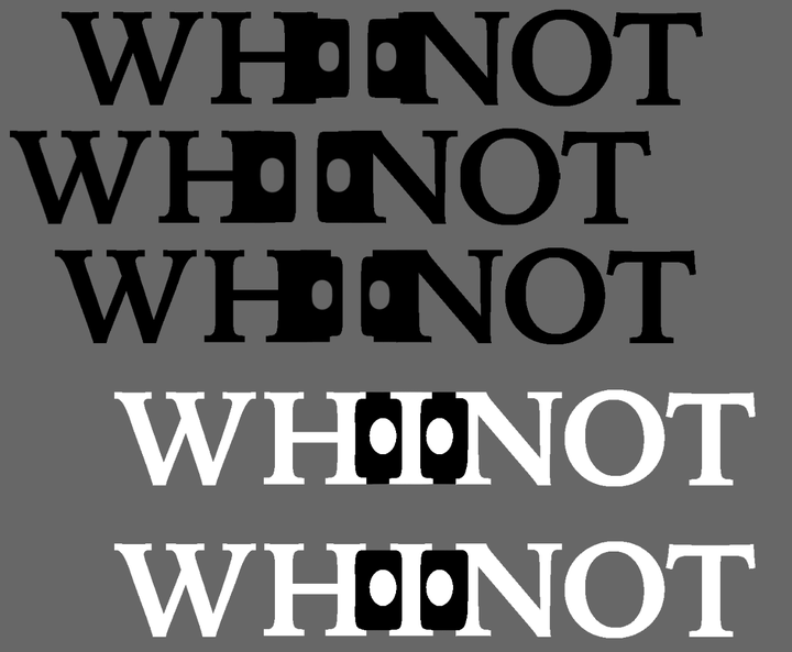
Figure 2. (Glasses Logo)
Next, I decided to try out my idea of placing Whinots eyes on either side of the I in WHINOT. There were of course challenges, things that just didn't look right. At some point I had to step back and acknowledge the fact that they drew focus away from the letter itself and made the name impossible to read. This is what lead me to the bottom two iterations, the latter of which i feel works best with this idea, if its what I end up going with
-
A different font may need to be used to better represent the brand, but as far as testing goes, I feel like ive proven to myself that its an idea worth keeping in my back pocket.
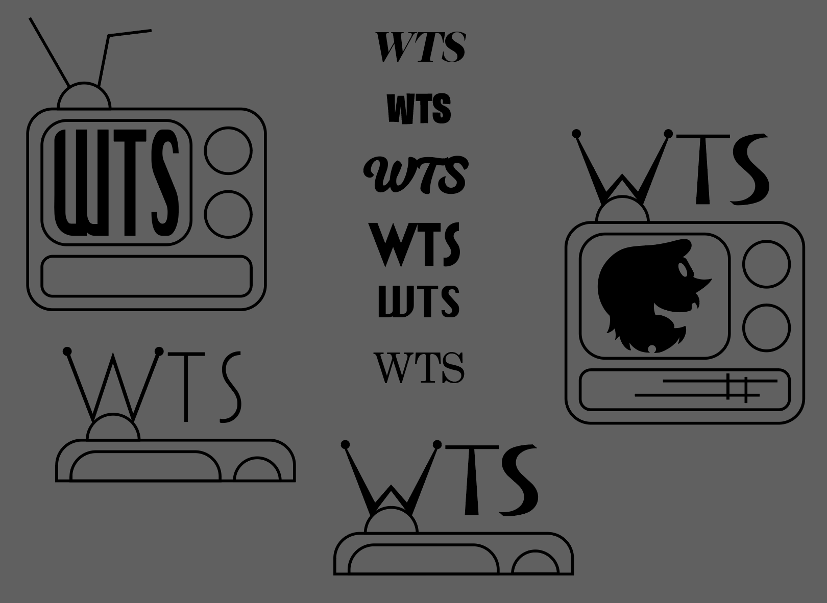
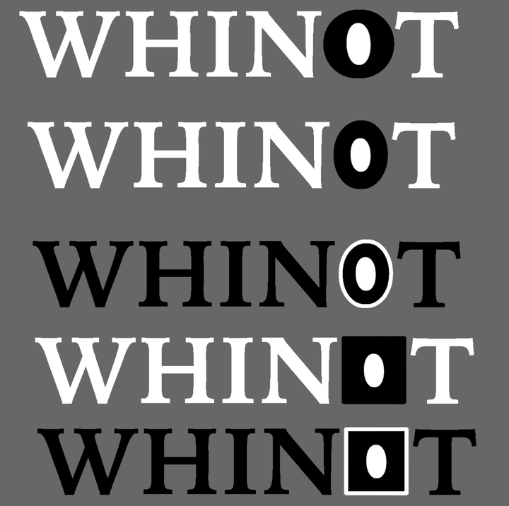
Figure 3. (Eyeball O)
This was another attempt at incorporating Whinots eyes into the font-face. I have to admit, so far its my favorite option. I really feel like its placement in the name makes things look interesting and memorable, and Im certain it wouldn’t look as good if this logo-mark was used as the dot of the i instead.
-
My one real concern is the fact that its not going to do very much good on its own, and there is a clear problem when colors are inverted. Because Whintos eye is a staple of the character design, and flipping its colors would effectively disconnect it from the brand.
For the purpose of making the logo stand out, I think if this is what I choose, the smart choice is going to go with the circle eye, rather than the square glassed eye. Most of the fonts im choosing between are very square in shape, and I need the O to stay a circle in order to draw more attention.
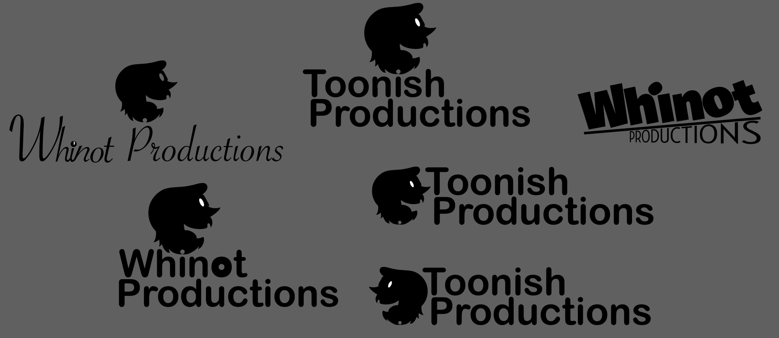
Fig 5. Silhouette Implementation
While the crest of the beard replacing the dot of the I does work, I feel like the arrangement looks best in ‘Toonish Productions’. And so far my favorite usage is when the silhouette is off to the side. I don’t know, theres just something appealing about it.
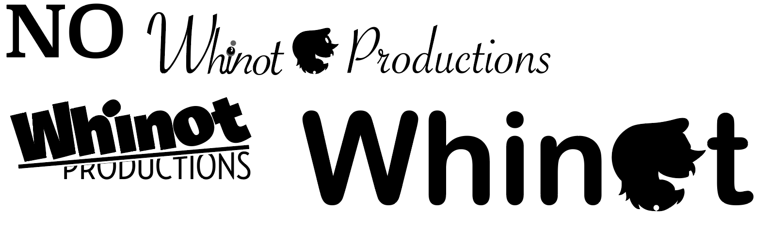
Fig 7. Bad Ideas
I started a specific part of my illustrator file for bad ideas. Im just doing whatever at the moment so that i can know and catalogue what works and what doesn't. Most noticeably, i’m trying to work with a possible rebrand. Its supposed to be named after my character Whinot Toonish. I want a name thats all encompassing. My work and its mediums are pretty much unlimited.
Fig 8. Symbol
I decided to try going down the initials route, starting with WTS. Because its only 3 characters, I thought it may be smart to go with a symbol. Something that went along with my more retro feel and focus on entertainment. One of my favorite fonts is Krungthep, and it reminded me of old analogue television sets. I admit, it was a bit much, but I had to start with something to get ideas flowing. Part way through I realized that the old bunny ear antenna could be a stand in for the W. For this, I went with a much thinner font , and added the little nubs at its ends. I also started experimenting a little with the font types boarders. Yes, its a little much, but at this point in time, I’m still just following random ideas to try and get a variety onto the page. No idea is a bad idea to add, just ideas I shouldnt run with
-
Whinot Productions
Toonish Productions
Whinot Toonish Studios (WTS)
WT Entertainment
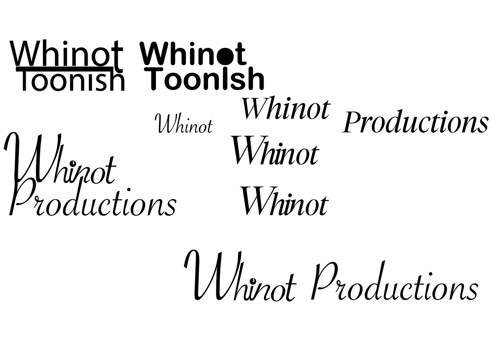
Fig 6. Other fonts
I did of course start trying a different set of fonts, just fooling around to see what would come up. I tried a variation on my usual Whinot signature, W nice and large, hin connected and then ot off to the side. I may keep working with a version of this going forward, I feel like theres something there, like how Walt Disneys logo has always been a variation on his signature.
Final Iterations
-
I knew that no matter what, I wanted the Whinot silhouette involved in the image. After many edits to the initial design, I landed on a relatively simplistic style that frames the logo well.
-
In the end, I went back to my discarded ideas and started playing more with my toppled typography idea, with an edit to the ‘Production’. It gives the logo a perfect feeling of being whimsical, if unbalanced and undefinable.
In the end I am very proud to say that I created a logo that perfectly embodies Whinot Productions in a nutshell